How to make your content editor's life easier by configuring your components right
With an ever growing content tree, what's the best way to make specific content more discoverable?
August 09, 2024 • 6 min read • Sitecore
Questions, questions, questions
Are you managing content on a large scale? Have you ever run into the problem that You or one of your colleagues has created a piece of content, but you can't find where it's been put? Would you like to be able to determine if a piece of content is of type A or type B at a quick glance? Is your team using (headless) SXA? If the answer to any or all of them is yes, keep on reading, I'll talk you through some best practises and pitfalls regarding content discoverability when using (headless) SXA!
The recommendations
Even though the recommendation's I'll list below are tailored towards (headless) SXA, concepts written out can apply to other Sitecore implementations too. Let's start off with the basic recommendation by Sitecore itself: "Always clone an existing rendering to create a new one". This is standard practise when working with SXA. It scaffolds all the necessary items needed across different parts of your Sitecore content tree. I have some additional actions that I like to do after the scaffolding process has completed. The actions I take afterwards serve the purpose of making content more easy to distinguish from each other.
- Update rendering icon
- Update rendering datasource icon
- Update datasource folder icon
- Configure the branch templates correctly
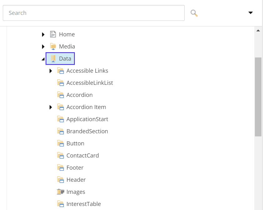
Although these actions look straight forward, there are some things regarding SXA that you'll have to know to get the best possible experience here. I usually keep the icons for these 3 things aligned, because it makes distinguishing between different pieces of content as obvious as possible. The rendering icon being the same as the datasource template (folder) icon makes discoverability much easier. Imagine the default scenario:

As you can see above, the folders for all these different pieces of content have the same icon, namely the icon which datasource folders have by default when cloning an existing rendering. Personally I'm not a fan, because I want to be able to differentiate at a glance. So keeping the folder / template / rendering icon in sync is my recommendation. How do we go about it achieving this?
Datasource, rendering and datasource folder configuration
When it comes to the datasource templates I like to make sure that both the rendering parameter template as well as the datasource template itself are configured to have the same icon. Choosing icons is hard enough, make use of this resource, sitecoreicons. Simply navigate to your datasource template, make sure you have standard fields checked in your view tab find the Appearance section on your template and paste the acquired icon in the Icon field. Repeat the process for parameters template, the datasource folder template and potentially any standard values to make things neat and consistent. This way when installing a headless module to a site or site collection we will have a consistent look and feel for renderings / datasources and datasource folders.
The confusing bit
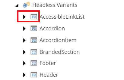
You'd think that configuring all that we've configured in the steps above would be enough. Helas, there's one thing that's overlooked easily and it's regarding (headless) variants. With cloning there's always at least one variant defined for each rendering. This too comes with an icon and if left unchanged will create the same mess as the datasource folders as shown above (just with a different icon).

You'd think that changing the setting would be a part of a branch template for that, but I'm highlighting this step specifically because it's somewhere different than you might expect.
It's a part of the settings node and is thus part of the module configuration. Let's say for arguments sake that we're working on a feature module called SimpleContent.
Then the path we're interested in to configure our headless variant in such a way that it's consistent with the other icons would be /sitecore/system/Settings/Feature/SimpleContent/Headless SimpleContent Site Setup/Rendering Variants.
There we will find all the rendering variants which are a part of the SimpleContent module and where we can configure a different icon for it.
By default the __Icon field will have the value Office/32x32/window_dialog.png. Change this to the same icon we configured in the steps above.
Bonus tip
If you know beforehand that the components you're going to build will have rendering variants and you want to make sure they're added to the (site / site collection) module installation script add them to the branch template!
Taking the same SimpleContent example module with a button which has 3 variants: default, primary and secondary, navigate to: /sitecore/templates/Branches/Feature/SimpleContent/Default Button Variant/$name.
There should already be the default rendering variant definition under that path, but add 2 more there by right clicking on $name and click on insert new variant definition.
Conclusion and caveats
There you have it, my recommendation for having a consistent look and feel regarding datasources / renderings and datasource folders. I would like to tell you that this works perfectly fine in all the (headless) SXA scenarios, but unfortunately it is not. Sitecore XM Cloud makes use of a whole new Pages editor / Explorer. The steps I described above work for part of it, but not entirely. Explorer doesn't allow you to configure icons for items (just yet). Everything you seen in explorer has the same Icon. Pages is more of a mixed bag. The components will for the most part have the Icons shown, although there might be some icons that you can get from sitecoreicons which aren't compatible with Pages but are with good old content editor. Similarly the page templates themselves can be configured to have an icon and it will show up perfectly fine in content editor (tree) view, but not in Pages, there it will just be the "blank document" icon for each page.
I do hope Sitecore will allow us more control over this in the future, so this recommendation of mine can be adhered to in the SaaS world too!